

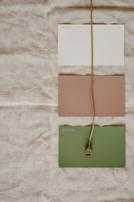
Creating a peaceful and calming environment in your home often starts with the colors you choose for your walls and décor. Calm colors can help reduce stress, promote relaxation, and make your living space feel welcoming and restful. If you’re considering repainting a room or decorating with soft shades, this guide will help you make thoughtful color choices that foster tranquility.
Why Choosing Calm Colors Matters
Colors influence our mood and feelings more than we often realize. Bright and bold colors can energize a space, but they may also feel overwhelming in places where you want to unwind. Calm colors, on the other hand, tend to be softer and less intense, encouraging relaxation and comfort. Choosing the right calm colors can improve your overall well-being and make your home a true sanctuary.
Popular Calm Color Families
When selecting calm colors, it helps to know which color families naturally evoke a sense of peace:
1. Blues
Blue is often associated with the sky and water, making it a naturally soothing color. Light blues and soft grays with blue undertones work well to create a serene atmosphere. Avoid overly bright or electric blues, which can feel too stimulating.
2. Greens
Green represents nature, growth, and balance. Softer greens, like sage or mint, provide a refreshing yet gentle background. These shades help bring a bit of the outdoors inside, contributing to a calming effect.
3. Neutrals
Neutral colors such as beige, taupe, light gray, and cream are versatile and inherently calming. They create a warm, inviting space without overstimulating the senses, making them perfect for living rooms and bedrooms.
4. Pastels
Pastel shades, including soft pinks, lavenders, and peaches, offer a subtle touch of color without overwhelming the room. These colors add warmth and softness.
Important Tips for Choosing Calm Colors
Consider the Room’s Purpose
Think about how you use the room. Bedrooms benefit from cool and relaxing colors like pale blue or soft green, which help calm the mind before sleep. Living rooms and reading nooks might work well with warm neutrals or gentle pastels that encourage comfort and socializing.
Test Samples in Different Light
Color changes depending on natural and artificial light. Paint small patches on your wall and observe them at different times of the day. This helps ensure the color keeps a calm tone in all lighting conditions.
Use Color Combinations
Layering different calm colors adds depth to a room. For example, pair a soft gray wall with white trim and pale blue accents. Combining various shades within the same color family avoids monotony and creates a harmonious look.
Pair Calm Colors with Natural Materials
Wood, stone, and natural textiles complement calm color palettes beautifully. The textures and organic feel enhance the relaxing environment.
Avoid Overuse of Dark Colors
While darker shades can add coziness, too much darkness can feel heavy or oppressive. If you want dark calm colors like navy or charcoal, balance them with lighter walls or plenty of natural light.
How to Use Color Accents for Calmness
Incorporate calm colors through accessories for those hesitant to paint walls immediately. Use throw pillows, rugs, curtains, or artwork in calming shades. These flexible choices allow you to experiment with color without a big commitment.
Avoiding Common Mistakes
– Don’t choose colors based solely on trends. Trendy colors can lose their appeal quickly; timeless calm shades often remain soothing for years.
– Don’t ignore undertones. Some colors may appear calm but have underlying warm or cool tones that change the mood. Understanding undertones helps you pick truly calming shades.
– Don’t overcrowd the space. Even with calm colors, too many decorations or furniture can feel chaotic. Keep spaces open and uncluttered to enhance calmness.
Final Thoughts
Choosing calm colors for your home enhances your daily living experience by making your spaces more restful and inviting. Start with colors that resonate with you and reflect the purpose of the room. Test and adjust before committing, and don’t be afraid to blend subtle hues and natural textures. With a little planning and thoughtful selections, your home can become a peaceful refuge designed around calm and comfort.